
Materials & form
Our crystal objects are never only about the mineral. Travertine, pink marble and wood change how color, translucency and scale are perceived — and help a group of crystal forms read as one composed object.
We pair crystal with travertine, pink marble and wood because each supporting material changes how the mineral is read. Matte travertine makes transparent crystals feel brighter; pink marble softens rose quartz; dark wood gives amethyst more contrast.
The crystal is the subject. The vessel gives it context.
A mineral specimen can be beautiful on its own, but the way it enters a room changes when it is given a base, tray or vessel. The supporting material creates scale and a boundary, turning several crystal elements into one object.
We deliberately keep the material language simple. The base should not compete with the mineral. It should make the crystal easier to see.
Travertine: matte, warm and architectural
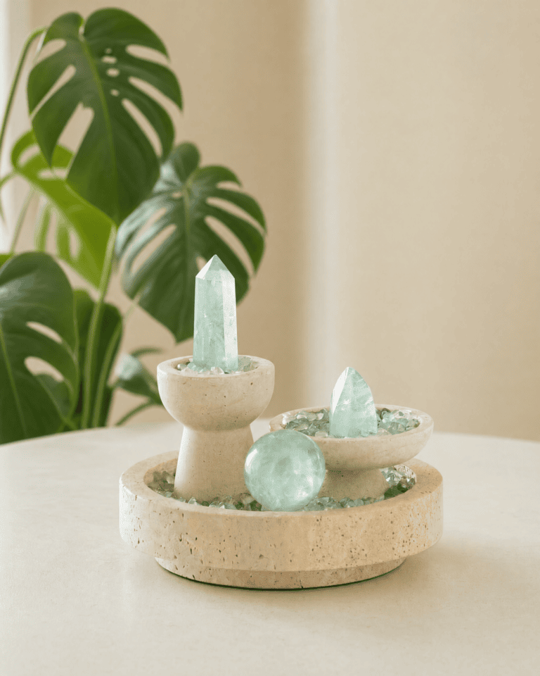
Travertine is one of our most useful supporting materials because it is visually quiet. Its pale tone and porous surface absorb light rather than reflect it, which makes polished or translucent minerals stand out more clearly.
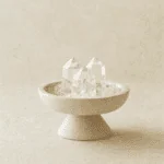
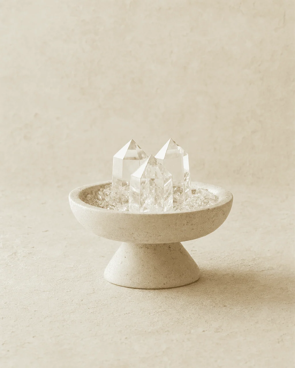
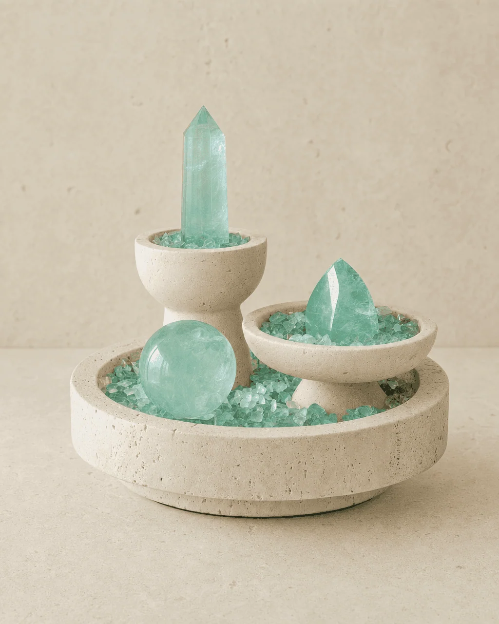
Clear quartz becomes brighter against travertine. Green fluorite gains contrast. Amethyst feels deeper because the surrounding material stays warm and restrained.
Pink marble: color without losing restraint
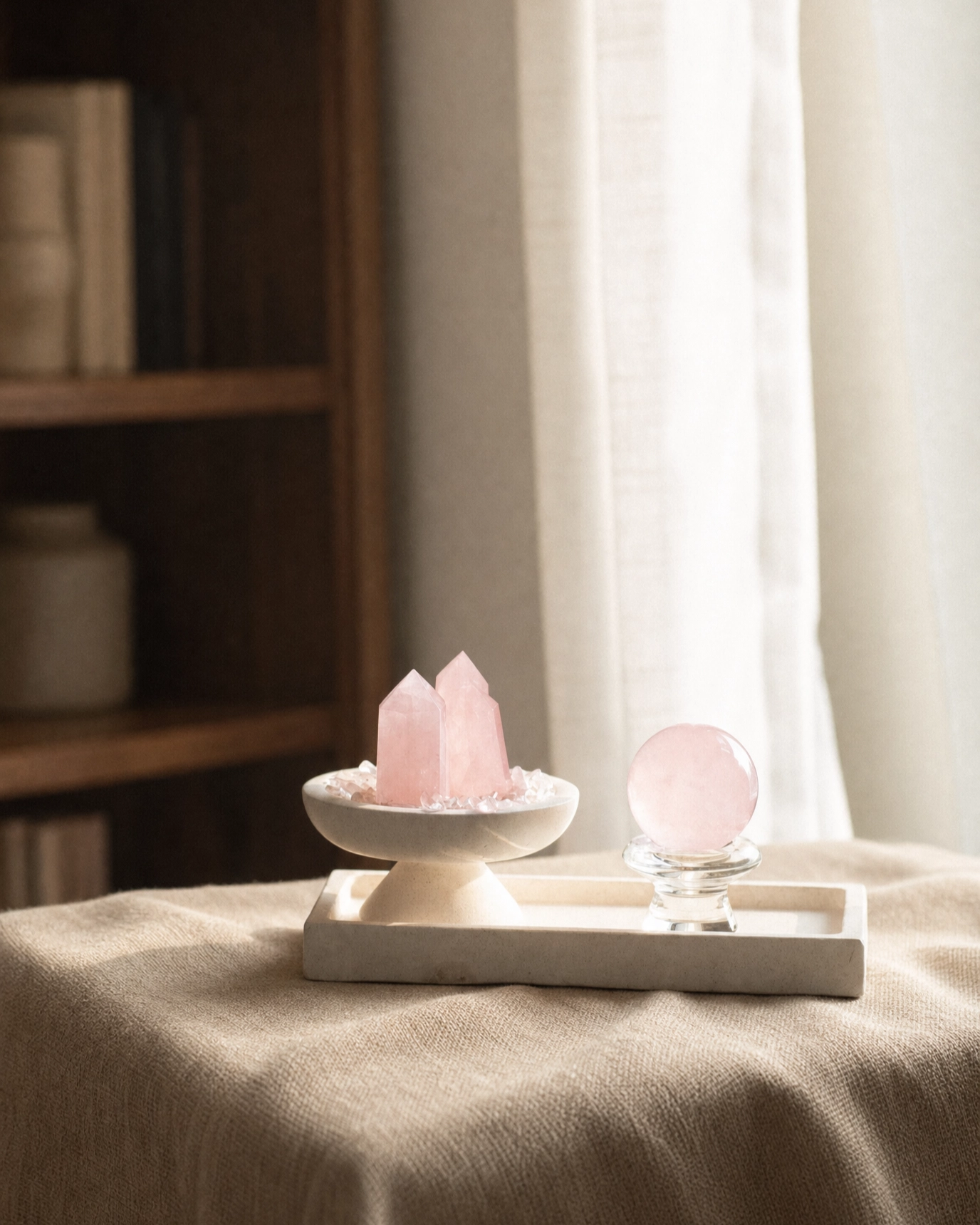
Pink marble is more polished and visually denser than travertine. We use it when the supporting material should participate in the color story rather than disappear entirely.
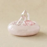
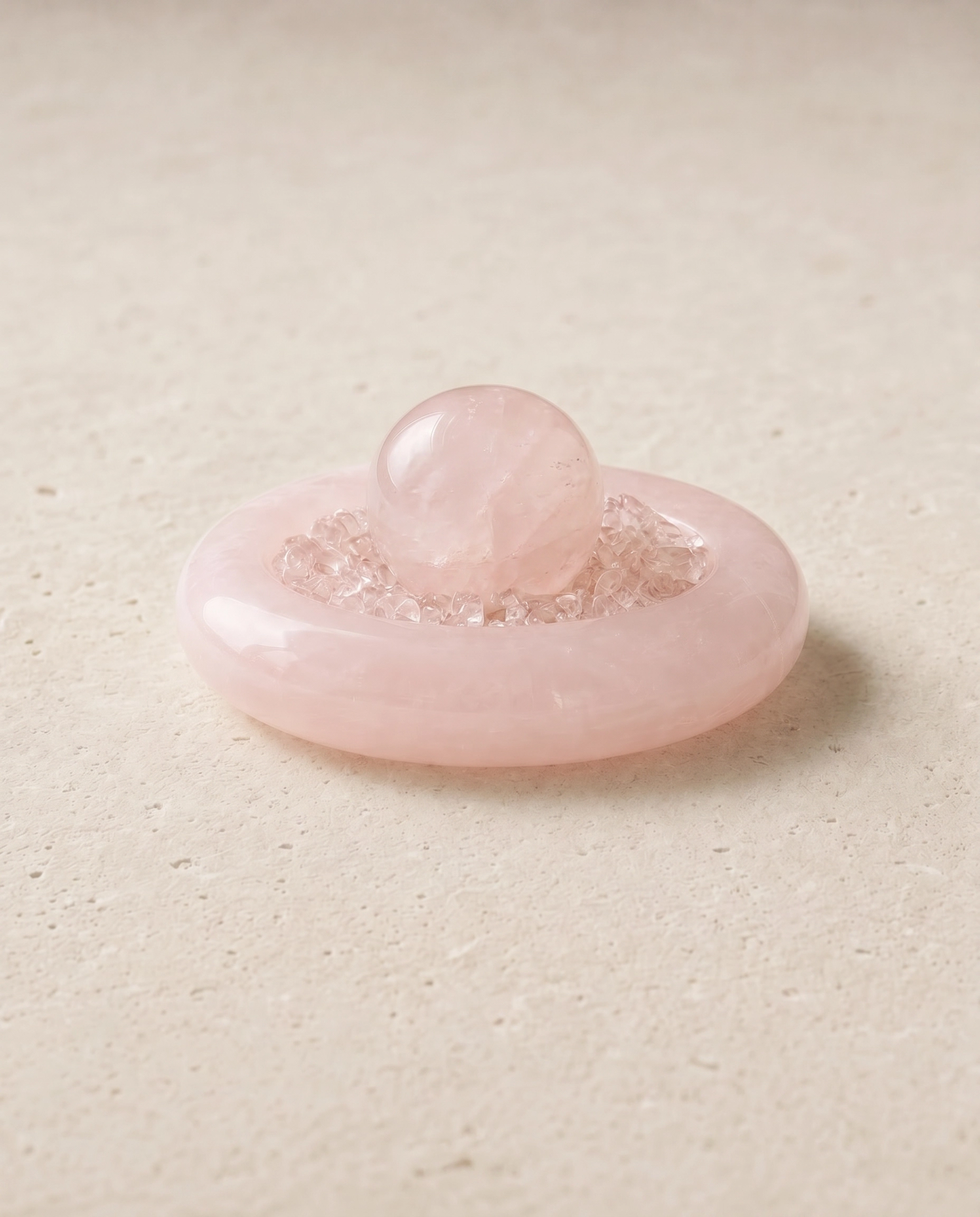
With rose quartz, the relationship is tonal: blush crystal against blush stone. The materials are close in color but not in behavior. Rose quartz carries soft translucency; polished marble reflects light across a more continuous surface.
Wood: useful when the mineral needs stronger contrast
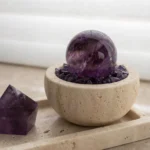
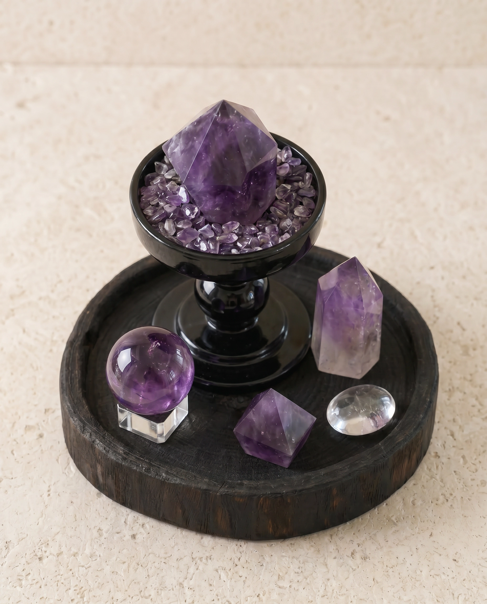
Dark wood changes the mood immediately. It gives amethyst a deeper frame and makes the violet color feel more graphic. The effect is less monochromatic than stone-on-stone and works especially well in rooms with timber furniture or darker accents.
How we decide which material supports which crystal
| Crystal | Supporting material | Reason |
|---|---|---|
| Clear Quartz | Travertine | Matte stone makes transparency and reflections easier to see |
| Fluorite | Travertine | Warm neutral stone balances green and aqua color |
| Rose Quartz | Pink marble or travertine | Creates a soft tonal relationship without losing texture |
| Amethyst | Dark wood or travertine | Wood adds contrast; travertine keeps the composition quieter |
Natural variation is part of the composition
None of these materials are visually uniform. Crystal carries color zoning, inclusions and internal fracture lines. Travertine carries pores and tonal movement. Marble carries veining and shifts in color. Wood brings grain and tone.
Those differences are not something we try to erase. The goal is consistency of proportion, finish and overall character — not identical surfaces from piece to piece.
Choosing between the materials
If you want the crystal to feel lighter and more architectural, travertine is usually the easiest pairing. If you want a softer tonal object, pink marble works especially well with rose quartz. If you want stronger contrast and a more graphic silhouette, dark wood gives amethyst and clear crystal forms a sharper frame.
Frequently asked questions
Why pair crystal with travertine?
Travertine is matte and warm, so it creates contrast with transparent or polished crystal without becoming the visual focus.
Does rose quartz work with pink marble?
Yes. The colors are related, but the materials behave differently in light. The result is tonal rather than flat.
Are natural variations considered defects?
Color zoning, inclusions, veining, pores and natural markings are expected in these materials. Product pages describe the intended composition and overall character of each piece.