
Living with crystal
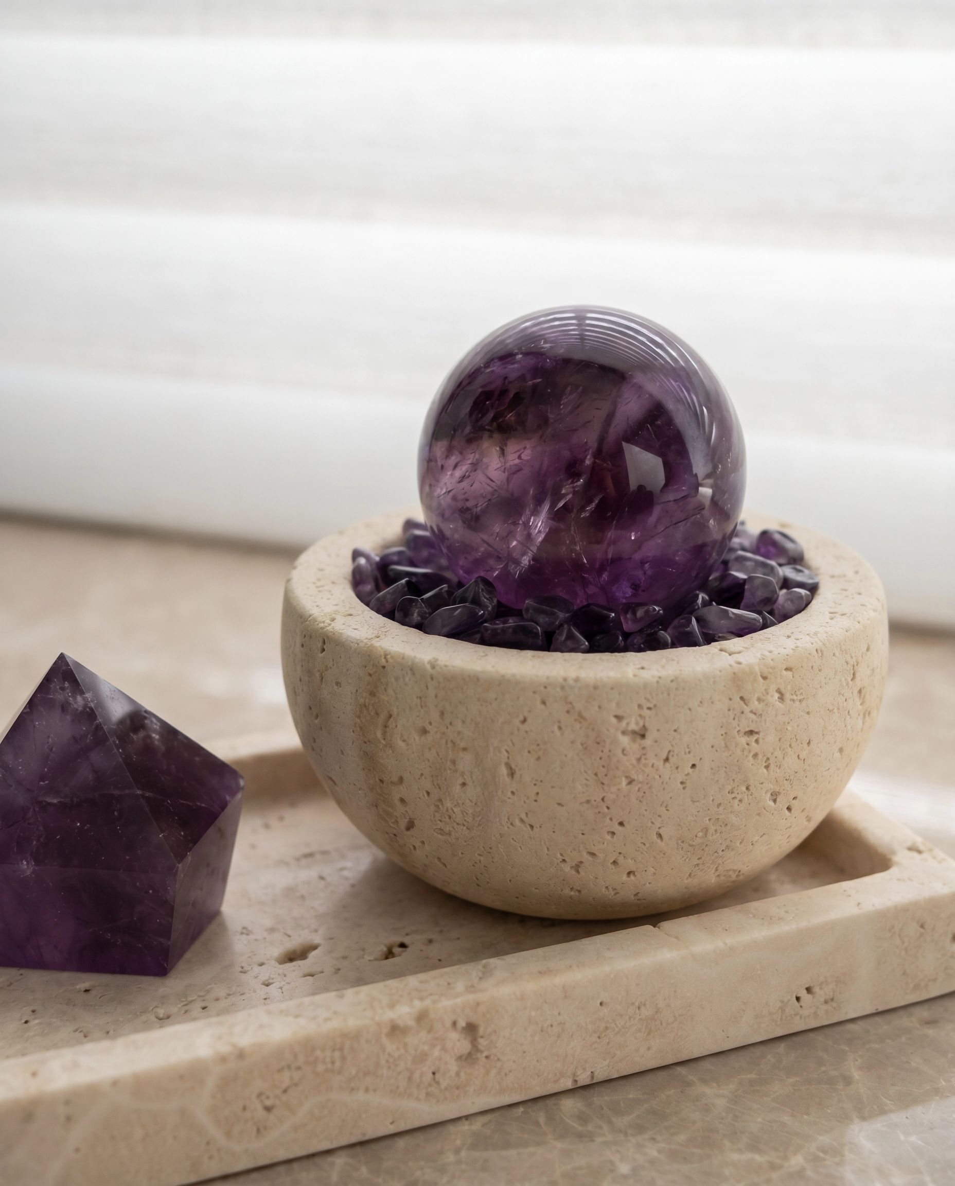
Travertine does not become dated because it is beige. It becomes predictable when every object in the room follows the same formula. Crystal can bring back contrast, color and material depth without disrupting a quiet interior.
Travertine still works in contemporary interiors when it is used as a quiet structural material rather than as part of an all-beige styling formula. Pairing it with crystal introduces color, translucency and a stronger focal point without making the room feel busy.
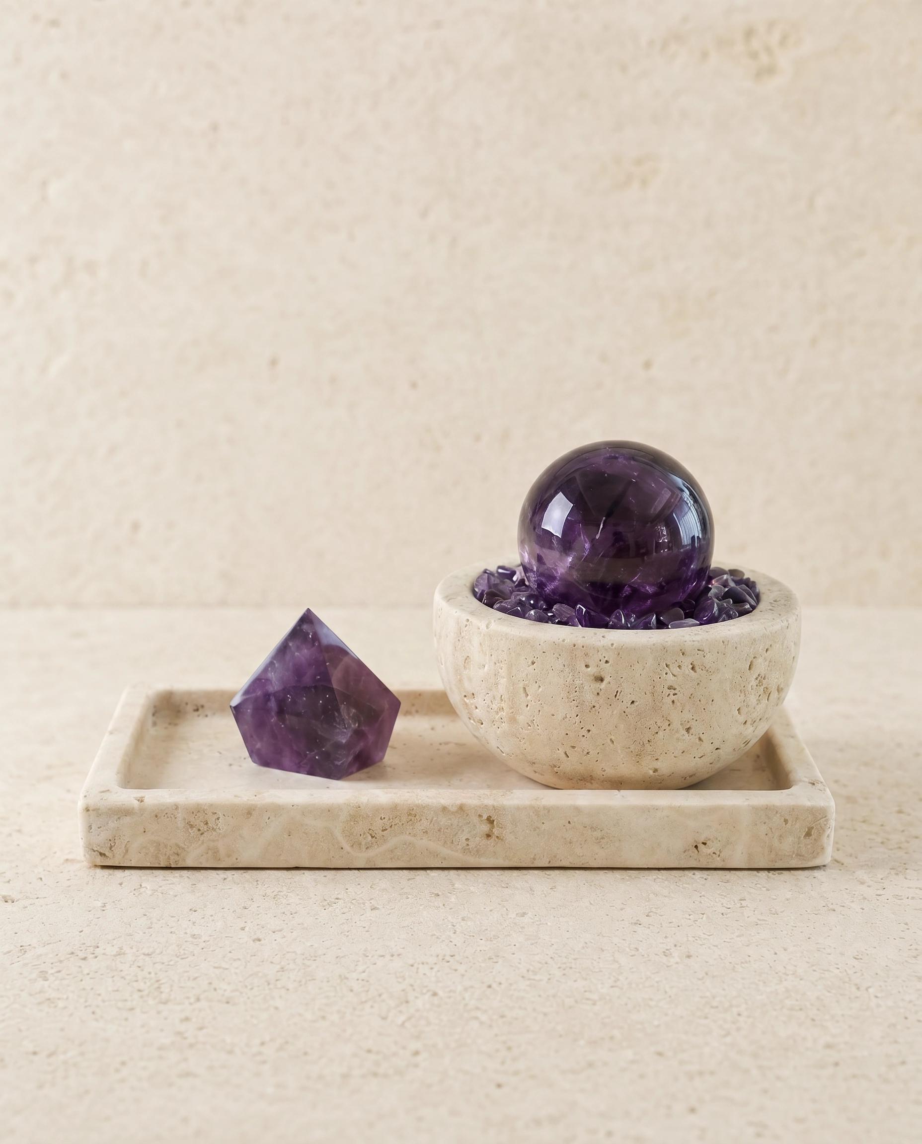
The problem is not travertine. It is sameness.
A neutral room becomes flat when every material sits in the same visual register: pale stone, pale timber, cream upholstery and objects chosen only because they disappear politely into the background. Travertine is often blamed for that effect, but the material itself is not the problem. The problem is repetition.
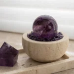
Crystal changes the equation because it introduces something stone alone does not: internal light, color variation and a more defined visual center. A single amethyst sphere, green fluorite point or clear quartz cluster can give a quiet room enough contrast to feel intentional rather than formulaic.
Use one crystal composition as the focal point
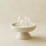
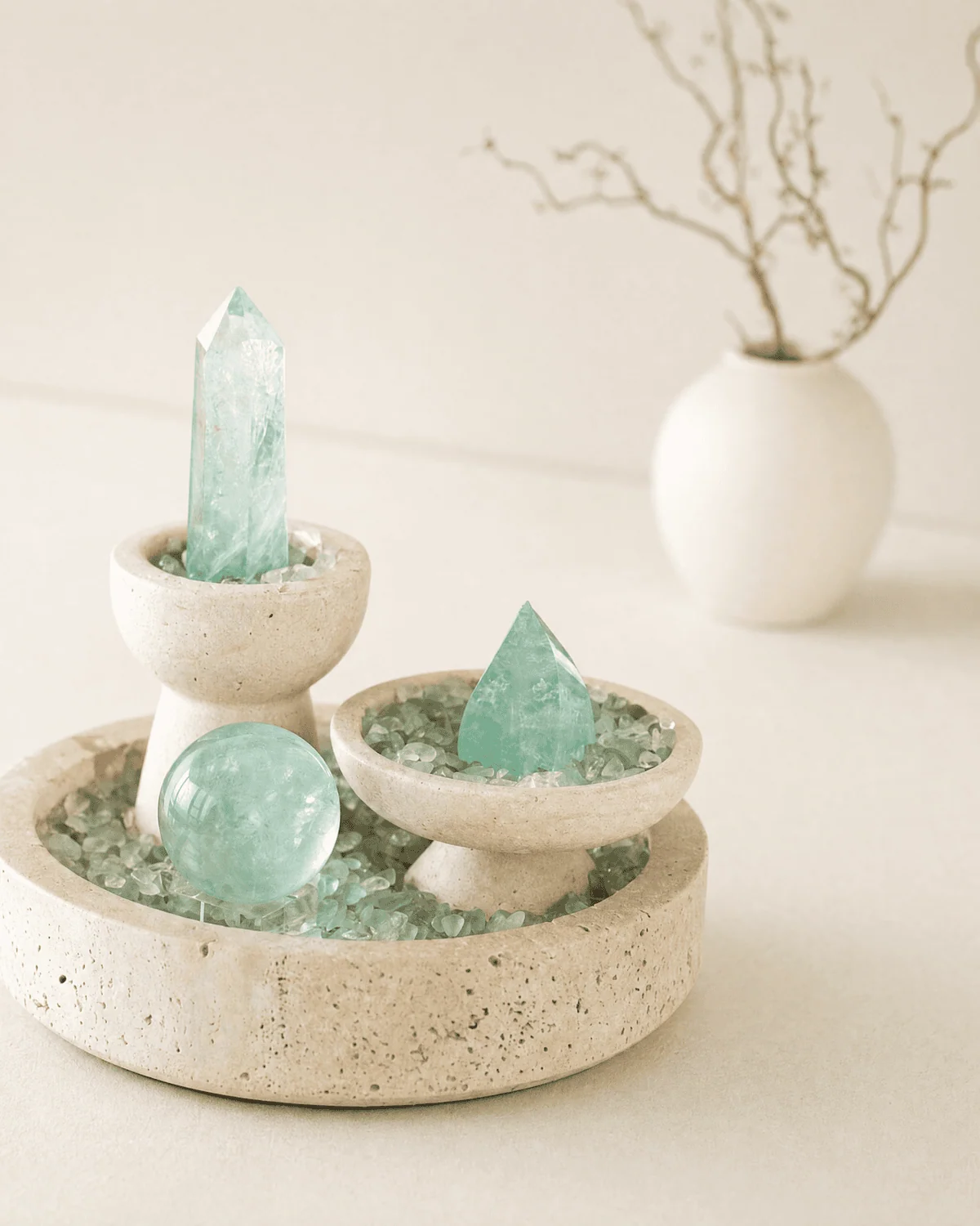
The easiest way to style crystal in a modern interior is to treat it as one object, not as a collection of small spiritual accessories. A composed piece on a tray or in a vessel reads more like a sculptural object and less like a shelf full of unrelated specimens.
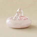
This is why we often combine mineral forms with travertine, pink marble or wood. The supporting material gives the crystal a boundary. The crystal provides the color and light.
Match the crystal to the room, not the trend
| Crystal | Visual effect | Works especially well with |
|---|---|---|
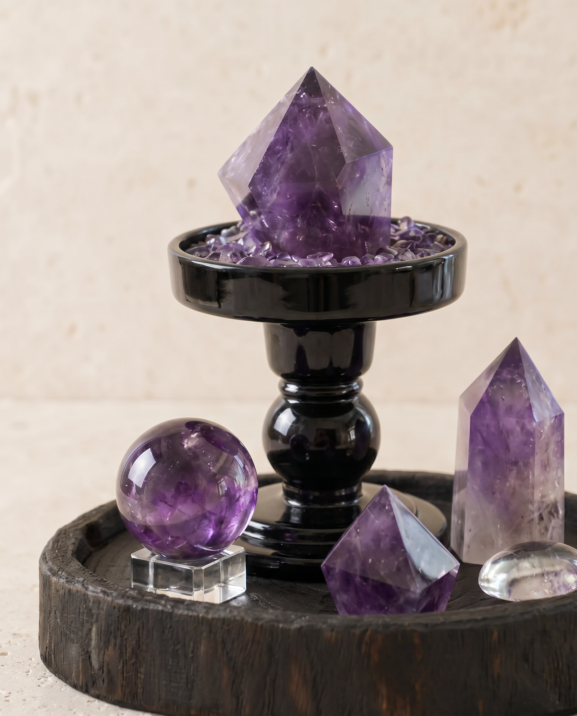
| Amethyst | Deep violet and visually grounding | Dark wood, warm plaster, cream upholstery |
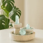
| Fluorite | Green to aqua, translucent, graphic | Travertine, oak, pale linen |
| Rose Quartz | Soft blush and low contrast | Pink marble, walnut, warm white |
| Clear Quartz | Bright, transparent, visually light | Travertine, glass, darker timber |
There is no need to match the crystal to every other object in the room. In fact, the composition usually feels more considered when it introduces one controlled contrast. The goal is not coordination for its own sake; it is hierarchy.
Scale matters more than quantity
On a console, coffee table or shelf, one well-scaled crystal object usually has more presence than several small pieces scattered across the surface. Leave enough empty space around it for the silhouette to register.
If you do use more than one object, change the scale or function. A crystal composition can sit beside a book, lamp or vessel, but avoid building a row of similarly sized decorative objects. The eye needs a clear first stop.
A neutral interior does not need to be colorless
Modern interiors often rely on restraint, but restraint is different from removing every strong color. Crystal can bring color in a way that still feels natural because the variation is built into the material itself.
The result can stay calm, minimal and architectural while feeling more specific. That is the balance we look for: enough contrast to make the object worth noticing, but not so much styling that the room starts to feel staged.
Explore the crystal collection →
Frequently asked questions
Does crystal decor have to look bohemian?
No. Crystal looks more contemporary when it is treated as material and form first: one composed object, a restrained palette and enough negative space around it.
Can you mix crystal with travertine?
Yes. Travertine gives a matte, architectural base while crystal adds translucency and color. The contrast is especially effective with fluorite, clear quartz and amethyst.
How many crystal objects should be in one room?
There is no fixed number. Start with one focal piece per surface or visual zone, then add only when the second object has a distinct role or scale.